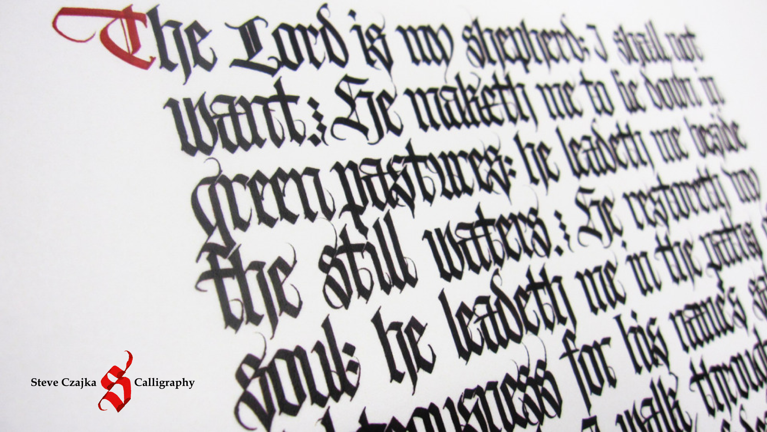
 A beautiful psalm that is historic yet modern at the same time. Watch a small promo of the piece in full HD video.
Five Years in the Making
This piece has extra special meaning for me. This piece has been with me along my journey for about 5 years of my life. I have come to love the words of the piece. I interpret the words in a modern meaning and the words give me hope and peace in my life. In the process of doing this piece I have consulted with quite a few people. I have come to learn how so many people also love the words. Many have said it is their favorite psalm, and some have said they cry a tear every time they read it. I admit this was the most difficult, and the most rewarding piece I have ever done. I have learned a great deal while doing this piece and this will remain with me forever. I am making piece available for purchase:
Digital Download 12″ x 18″ on White ($750)
This piece is 3600×5400 @300dpi totalling 3.36MB.
Digital Download 12″ x 18″ on Black ($900)
This piece is 3600×5400 @300dpi totalling 4.61MB.
Canvas Stretched Version 32″ x 48″ on White ($1500)
This is a large piece almost 3′ by 4′. This is digitally printed on a high quality durable matte finished canvas (as shown in the video above) stretched onto a canvas frame. Allow 4 weeks for preparation. Deposit required. Shipping extra.
My Design Journey
The idea for this piece came to me in 2009, and was completed in 2014. Originally I had an idea that I would do this psalm next to a modification of my original 1980s calligraphy border. That was the original design concept I worked with for a few months. I tried a number of different options and accepted that none of them were working.
I went back to the drawing board and restarted from scratch. I did some soul searching as to what this should look like. I knew I wanted it to be big and leave a lasting impression on people. Similar to when I first viewed Anthony Hostovechy’s piece titled Love. A piece that was over 10′ tall and just stunning to look at. Love was the inspiration for me.
The journey led me to further develop my skills in pen manipulation and advanced Gothic scripts. I had connected with a highly skilled calligrapher who helped me to refine my skills and he fostered my learning to more historic writings. I became obsessed with learning more about specific typefaces like textura, and how textura fit into the history of religious manuscripts between the 9th and 12th centuries.
My design goals changed and led me towards creating a more historic manuscript type piece in keeping with the religious theme. The layout was critical and I wanted the final piece to look like a page of the manuscript, but I wanted it to have my own look. So I aborted the manuscript look, and started a new design path, the third design path.
In the meantime I embarked on a very ambitious project of designing my own custom typeface called “textura tall and narrow” back in 2012. This was my own creation of an elongated and narrow custom textura calligraphy. I subsequently learned uncial, (that appears at the bottom title) and rotunda that appears in various wallpaper layouts. In order to accomplish these typefaces I needed to further learn and advance my skills in GIMP and Inkscape which are open source computer software packages similar to Adobe Photoshop and Illustrator respectively. GIMP and Inkscape were used to assist with the layout and design of this project.
By 2013 I had furthered my understanding and workflow of typeface creation as well as layout. I had completed a few larger pieces in between such as Letters Interacting and Twitter Mural. I had also studied layout in calligraphic design. In the process of doing this, I shifted slightly to a bolder, more German looking design for the Twenty-Third Psalm piece. I called this final design “Black”. Black represented the historic (1920s-40s) black letter revival pieces that were done with white letters on a black background. Black represented a very BOLD and striking appearance. One design element on the page – a solid block of Gothic text, aligned perfectly on either side.
I had finished the design by the fall of 2013, and printed a few drafts. I sat on this until June of 2014 where I finalized the design layout and later generated the final print tests and copies. I like to sit on a design for a while to see if it still looks good a few months later. Sitting on a piece is a good test to see if I still like it — I loved it then and still do today. The best test was after the first large format print was done, and the expression on my face when i first viewed it, totally loved it.
