Circular Calligraphy Border Preview – Part 1

Calligraphy_border_-_round_-_s

The Project: 


For me this was a medium sized calligraphy and graphic arts  project.  I walk you through the making of the entire project in this 5 part video tutorial series. 

  
If you are using the IE browser and are unable to view this, kindly visit my youtube page to watch the video at:  www.youtube.com/user/steveczajka 

  Continue reading

Steve Jobs Tips his Hat to Calligraphy

Steve_jobs_hd_signature

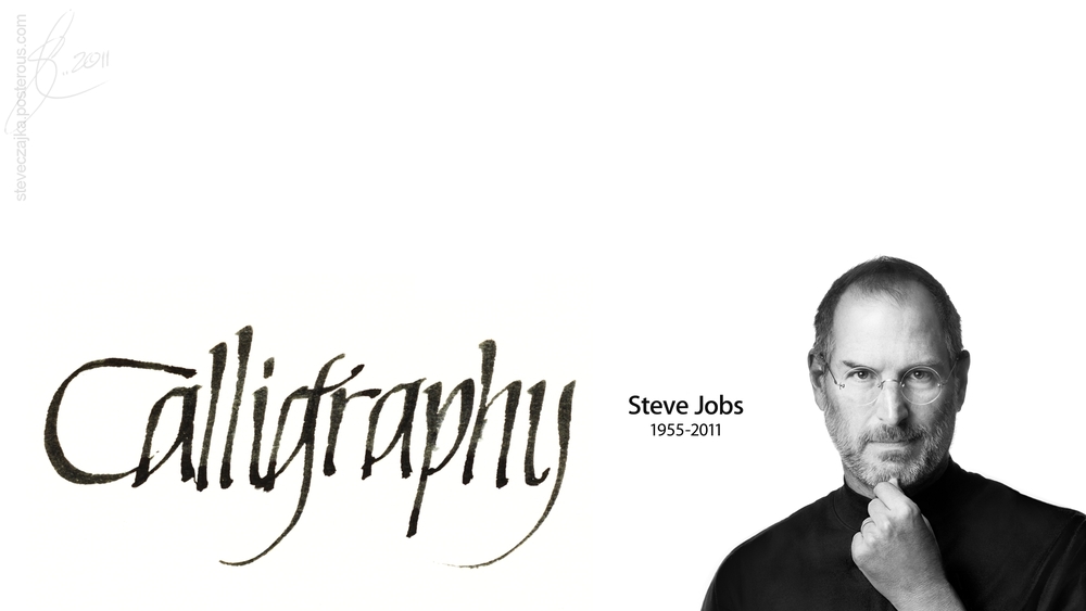
It seems that we can attribute the choice of interesting fonts we have on our personal computers to Steve Jobs and a single calligraphy course he took. He talked about it in the commencement address he made at Stanford University on June 12, 2005.
“Reed College at that time offered perhaps the best calligraphy instruction in the country. Throughout the campus every poster, every label on every drawer, was beautifully hand calligraphed. Because I had dropped out and didn’t have to take the normal classes, I decided to take a calligraphy class to learn how to do this. I learned about serif and san serif typefaces, about varying the amount of space between different letter combinations, about what makes great typography great. It was beautiful, historical, artistically subtle in a way that science can’t capture, and I found it fascinating.
None of this had even a hope of any practical application in my life. But ten years later, when we were designing the first Macintosh computer, it all came back to me. And we designed it all into the Mac. It was the first computer with beautiful typography. If I had never dropped in on that single course in college, the Mac would have never had multiple typefaces or proportionally spaced fonts. And since Windows just copied the Mac, it’s likely that no personal computer would have them. If I had never dropped out, I would have never dropped in on this calligraphy class, and personal computers might not have the wonderful typography that they do. Of course it was impossible to connect the dots looking forward when I was in college. But it was very, very clear looking backwards ten years later.”

To read the full address, here’s the link, complete with embedded video:
http://news.stanford.edu/news/2005/june15/jobs-061505.html

The Amber Trailer

Amber_youtube_trailer_blog_ima

I am proud to say that this amazing artwork was done by my sister, Chris Davis of Burlington, Ontario, Canada. I have been following her artwork over the years, but when I saw this piece (a charcoal sketch) I was absolutely blown away. I think her artwork is incredible. I asked her if she would be willing to do a collaboration with my calligraphy and here is a preview of the works. I will blog about these three pieces in great detail over the next few weeks, but for now check out the Amber Trailer on YouTube:


This video is available in HD 720p quality. Cheers Steve!

Authentic

Authentic_baseball_hd_wallpape

What do you think of when someone mentions the word “Authentic”? I think of the Starbucks logo, Converse, Coca-Cola. These companies have stayed true to the lineage of their original logos and original products. Having said that it is hard to differentiate between “authentic” and “original”. Is there a difference?
Continue reading

Rik Emmett

Rik_emmett_w_guitar_hd_wallpap

According to Wikipedia, Richard Gordon (Rik) Emmett (born July 10, 1953 in Toronto, Ontario) is a vocalist, guitarist, and founding member of the Canadian rock band Triumph. Emmett left Triumph in 1988 to pursue a solo career. His first solo album, Absolutely, was released in 1990 and became a moderate hit across North America thanks to the hits “When a Heart Breaks” and “Saved by Love”. He is also a writer for Guitar Player magazine and teaches song writing and music business at Humber College in Toronto. This is a tribute to his music.
Continue reading